Flex
Estimated reading time: 2 minuteswhat is Flexbox ?
.flexbox-container {
  -webkit-display: -webkit-box;
  -webkit-display: -webkit-flex;
  display: -webkit-box;
  display: -ms-flexbox;
  display: flex;
}
flex properties
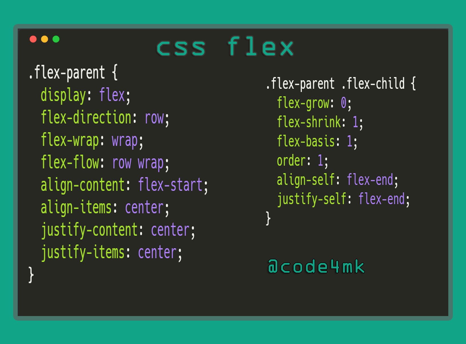
flex
flex: grow , shrink , basis
flex-basis
- initial width / height (max)
flex-basis: 1,flex-basis: 200pxflex-direction
- position ( horizontal or vertical)
row , row-reverse , column , column-reverse
flex-direction: row | row-reverse | column | column-reverse
flex-flow
flex-flow: flex-direction flex-wrap;
flex-grow
- as like width: 30%
Any positive number flex-grow: 1 , flex-grow: 2
flex-shrink
It is also a positive number . Initial value is 0 . value low is greater.
flex-wrap
one linetomulti-linesystem (device)
nowrap ,wrap , wrap-reverse
flex-wrap: nowrap | wrap | wrap-reverse
justify-content
- A type of float
flex-start|flex-end|center|space-between|space-around
justify-content: flex-start | flex-end | center | space-between | space-around
order
Any integer number as like order: 1 , order: -1
align-content
- vertical position
flex-start |
flex-end |
center |
space-between |
space-around |
vertical system
align-content: flex-start | flex-end | center | space-between | space-around | stretch
align-items
flex-start | flex-end | center | baseline | stretch
align-items: flex-start | flex-end | center | baseline | stretch
align-self
- individual vertical position
auto | flex-start | flex-end | center | baseline | stretch
align-self: auto | flex-start | flex-end | center | baseline | stretch
-
source: MDN
-
source: FreeCodeCamp
-
source: scotch
-
source : scotch demo
*** -
http://flexbox.help/
-
https://codepen.io/mostafa6765/pen/aVvPzB
-
https://tympanus.net/codrops/css_reference/flexbox/
-
https://github.com/afonsopacifer/awesome-flexbox
***